Showing posts with label Analysis. Show all posts

Saturday, 4 January 2014

Film Comment Magazine Cover Analysis

As I mentioned previously, I liked the simplicity of Film Comment magazine, so I have decided to use this as my main inspiration for the creation of my own magazine cover. Here is my analysis of the Prometheus cover;
I think that the focus on photography here is key to what makes the cover look good, and the fact that the colour theme runs across the cover. This aspect will be particularly inspirational, as I will not be able to recreate something like the cover of Empire which focuses on CGI. I will use a colour theme similar to this, and try to make a cover that is free of the clutter that cover lines and thumbnails create. 

Sunday, 15 December 2013

Let the Right One In Poster Analysis

After doing research into horror film posters, I found the illustrative poster for the 2008 film, 'Let the Right One In' to be particularly inspirational. Here is my analysis of the poster on Flickr. I hope to use this as inspiration for my own poster, as I really like the use of contrasting colours and the use of blood to implicate death without the explicit image of a dead body. 

Wednesday, 27 November 2013

Let the Right One In Trailer Analysis

After looking at several film trailers for inspiration, we have decided to use some components of the trailer for 'Let the Right One In' as inspiration for our own trailer. Below is an analysis of the trailer, looking at the use of sound, mise en scene, cinematography and editing.


Within the trailer, certain features, such as the use of blue filters, the build up of tension through fast cuts and an elongated shot at the end (which draws the trailer to a close), have caught our eye.

Sunday, 8 September 2013

You're Next - Rue Morgue magazine cover analysis

After discovering Rue Morgue magazine, I decided to analyse one of their covers (this issue is from last month) which features a new horror film 'You're Next'. I could not find a magazine which featured The Conjuring, however, I like this cover and hope to take inspiration from this, and other Rue Morgue magazine covers when creating my own. Below is the cover that I have analysed. 
You're Next is a horror film, following a family who are attacked while on holiday by a gang of mystery killers. Here is the link for my analysis of the cover on flickr;

Sunday, 1 September 2013

The Wolverine - Total film Wolverine issue analysis

As well as looking at the trailer and poster for the Wolverine film, I also looked at a magazine cover for 'Total Film', which was The Wolverine issue and featured the film on the front cover.


Here is the link to my analysis of the poster on Flickr;
http://www.flickr.com/photos/zoeradford/9699300273/in/photostream/

By looking at the codes, conventions and features of this magazine cover, it has allowed me to see how a large, high budget film would be promoted on the cover of a magazine. Obviously I will not be able to create something that looks like this, as the level of CGI is higher than I could achieve on photoshop with the images I will capture. This has provided me with research that I will use for my own - I will need to find magazines that are more independent, and that have a cover that I have the ability to create.

Wednesday, 28 August 2013

The Conjuring - Poster Analysis


This is one of the posters used to advertise the new horror film 'The Conjuring'. This poster is used not only in Britain, but internationally.

Here is the link to my analysis of the poster on Flickr; 

Overall, I find this poster very effective in creating a sense of mystery and fear, which are two main features of the horror genre. I like the use of low key lighting, and the simplicity of it. I hope to include these factors within my own film poster that I will create - even though this film obviously had a bigger budget than I have, to recreate something as effective as this would be fairly simple using the equipment that is available to me. I will try to create a poster that creates this amount of suspense through the imagery used. 

Saturday, 10 August 2013

The Wolverine - Poster Analysis


This is just one of the many posters that have been created for the advertisement of ‘The Wolverine’. Film posters give the viewer an insight into the film without giving too much away, and through analysis, we can discover the connotations of even the smallest details, which may influence the viewer and make them want to go and watch the film.

Here is the link to my analysis of the poster on Flickr; http://www.flickr.com/photos/zoeradford/9634417575/

I think that this poster is very effective in drawing in an audience that would be interested in the action based genre. Any fans of the X-men series would be attracted by this poster due to the main focus being Wolverine himself, and the fluidity of the CGI means that although this poster is completely put together using a computer, it is done in such a way that we wouldn't question it - it is extremely professional looking. This is an example of what a film with a large budget can create for their advertising campaign. 

After seeing what a high budget film can create for the poster advertising of their film, I will now look at more independent films, and how they promote their films. 

Sunday, 21 July 2013

The Conjuring - Official Trailer #1 Analysis


My analysis for The Conjuring official trailer (#1)

Here is the link for the trailer I have analysed

I thought that this trailer for 'The Conjuring' was very effective in the creation of tension and suspense through the use of sound. In my own trailer, I will try to use sound to create tension in this way. 

Thursday, 11 July 2013

The Wolverine - International Trailer Analysis


My analysis for The Wolverine International trailer

Here is the link for The Wolverine trailer that I have analysed.

Due to the fact that this film is a high budget, action movie, I will not be using this trailer as inspiration for my own trailer. However, it has provided me with an idea of what can be created on a higher budget. With my budget (which is limited because I am an A level student with no funding), I hope to create something as effective as this, but through the use of cinematography (which was picked up on as being an important feature in the results of my questionnaire) I hope to create a trailer which is successful in engaging an audience in the way that this trailer did. 

Tuesday, 2 July 2013

Saw Trailer Analysis

I decided to look at an older example of a horror film trailer to extend my research by looking at the Saw trailer. At the time of it's release in 2004, the first Saw film was revolutionary within the horror film genre. Even though it's trailer was more low budgeted, it has many interesting features to analyse. 

There is no doubt from this trailer that it is in the horror genre, and the codes and conventions of typical horror trailers can be found within it. The lighting plays a large role in creating a creepy atmosphere, with lots of low key lighting in many parts. This gives it a very dark feeling, which is common for horror trailers and films. However, in some parts, there is high key lighting, but this light is bright and white, which suggests that something unnatural about the situation that the film is centred round. When looking at the mise-en-scene of this trailer, we also see conventions which indicate the horror genre. For example, the mask that we see (that the character of 'Jigsaw' wears) is creepy, and may frighten younger viewers.

The structure of the trailer also gives us an idea into what the film entails. At first, we have the scene of the man taking photos in an apartment - the room is very dark, with only quick, bright flashes of the camera flash  lighting up the room. Apart from the diagetic noise of the camera, there is no other sound in the first few seconds. Even in these few seconds, we can already identify the genre through the use of lighting. Right through to the end, not much is revealed about the plot of the film, leaving a certain amount of mystery for the audience (which would entice them to see it at the cinema). At the end, the title is shown, along with the dialogue of the character of 'Jigsaw' 'Live or die, make your choice...' which then fades to black. Again, this statement does not give too much away, creating mystery.

In this trailer, there are many interesting features of cinematography. There are a lot of jump cuts, rapid editing used, and swift camera movements, which provide a quick pace for he plot to run at. This builds tension, and reinforces the horror genre. The use of CCTV footage also suggests the idea of voyeurism, which is a key feature of the story of film. Green filters also give it an eerie feel, and the shadows accentuate this. Close ups and extreme close ups are used to shows the fear and emotion on the characters faces, which gives the audience an amount of sympathy for them, which may keep their attention and focus on the characters throughout the film. Other interesting edits include the break up of scenes with 'fade to black' transitions, and the use of text in between cuts. The fades help to reinforce the dark feel to the trailer, and the text, with words such as 'Psychopath' and 'Madman' also implies to the audience that the killer is someone to be afraid of (most people are afraid of psychopathic murderers in films such as Saw, which helps us to identify this as a horror film).

The use of sound is also an important component of the trailer. At the beginning, we start of with the scene of the man taking photos. The diagetic sound from the flash, and the POV (point of view) shot of the man, allow the audience to feel as though we are there with him, and as the scene moves on, the creepy sound effect of the strange laughing is heard. Due to the room being dark, we cannot see the source of this sound, so it becomes non-diagetic, and the fear of the unknown makes this scene uneasy to watch without feeling a sense of trepidation. The voice of the killer is also distorted (by the killer himself in the film to protect his identity) and is used throughout the trailer as a voice over to add to the plot, and help the audience to understand what it is about more. Again, this is quite creepy and is used to instil fear. Dialogue from other characters is also used to reveal a certain amount of the plot to the audience.

Due to the fact that is a horror genre, this film is clearly aimed at adults. Even some of the content of the trailer may be unsuitable for young children (all of the features that I mentioned) and the insinuation of pain and gore (the section of the advert which implies that the characters must saw off their own feet would be extremely unsuitable for children). The screaming and warped sound effects would also be too suggestive and frightening for children.

Below is the original trailer for Saw.


I really liked the use of lighting and editing in this trailer - the bright white/ blue filters created an unnatural and clinical feel, and the fades in between shots kept the trailer running fluidly. This trailer is for a horror film that features a lot of gore which will not be a part of our trailer, however, I will use these components of this trailer (the use of lighting and editing) as inspiration for my own trailer.

Friday, 21 June 2013

Analysing my market research

A week after asking people to fill out my questionnaire, I looked at the results that I had gathered. As you can see from my results, people's view on trailers are very clear. When looking at which genre of film people preferred, horror was the most popular. This will be something that I consider when creating my own trailer, in order to strongly attract an audience. Also, when looking at the results of question 7 (What feature attracts you most to a film when watching a trailer ? ) 13 people chose a good story as the defining feature and 5 people said cinematography. Again, these are both things that I want to consider when filming my own trailer.  It was interesting to see everyone's reasoning behind their decision for this question too. I will have to think very carefully about my choices, and use this information to my advantage. 

https://docs.google.com/forms/d/1Mj0Xx4tD2NAgryYYVUg_Cb4lUrg53yWhqOn3Aelsths/viewanalytics

Tuesday, 18 June 2013

Analysing a film trailer - Moonrise Kingdom (2012)

After looking at the codes and conventions of the three films, I decided to analyse the Moonrise Kingdom trailer further. This film was released in 2012, and directed by Wes Anderson. As I mentioned before, it is of the 'Rites of Passage' genre. In this post I will discuss the use of codes and conventions used in the construction of this trailer.


It is clear from this trailer who the main characters are from within the first few seconds, as a scene from the film introduces a young boy (Sam) and the young girl (Suzy). As usual from trailers, no specific spoilers are given, but the plot is established - that the two run away together. This is a common convention of a trailer, to establish the main characters and plot. As well as introducing the two main characters, during the trailer, other smaller characters are introduced, through snippets of dialogue and scenes from the film. These characters are not developed, however, due to the fact that this film contains several well known actors, within the second half of the trailer, clips of the characters are accompanied by the names of the actors on screen. This is more of a common feature of a mainstream Hollywood  film trailer.

This trailer starts quite unusually with a scene from the film, with no music in the background, only the dialogue from characters. These clips of dialogue are consistent throughout the trailer, and they act like a voice over, letting the audience know what the characters plans are for the film and therefore a brief overview of the narrative. However, it does not give too much away - it still holds back enough to make the audience want to view the whole film.

Snippets of dialogue are very common in most film trailers and are used for this purpose. The 'snatches' of dialogue are joined by the accompanying scenes from the film, most of them portraying the most exciting moments. These are shown in many jump cuts towards the end, as it builds up with more dramatic music, creating a lot of suspense (known as 'the rise' of a trailer). At the end of the rise, the film title is displayed against a slow motion scene, which gives the audience a chance to read it before the trailer goes into the turn line - a point in which the music dies down for a single line of dialogue after the build up of music. Again, this is an extremely common feature among most film trailers.

As well as a list of the cast and the title of the film, the writers are also given credit. This is due to the fact that Wes Anderson is a well known film director and Roman Coppola is a well known film and music video director. This is a common convention when the names of the writers/ directors are famous. A lot of trailers usually have quotes from newspapers or magazines to promote the film, however in this trailer, this seems to be absent. This may be due to the famous cast and director, but it is still an anomaly for a film trailer.

Below is the official trailer for Moonrise Kingdom from YouTube.


This film is in the 'rites of passage' genre, and so I will not be looking at this for inspiration, however, I love the interesting cinematography components that are Wes Anderson's signature. I hope to feature interesting cinematography in my own trailer, to make it interesting and engaging for the audience to watch. 

Sunday, 16 June 2013

Analysing a film trailer - the codes and conventions of a 'rites of passage' trailer

I decided to look at several trailers from the 'Rites of Passage' genre for the beginning of my research, until I receive the results of my questionnaire (which will help me to decide what genre I want to focus on). I looked at the trailers for the films 'Submarine' (2009), 'Moonrise Kingdom' (2012) and 'The Perks of being a Wallflower' (2012). I have added the links for each trailer below.

Due to the fact that these trailers are all of the same genre, they have many similarities when you consider their codes and conventions. In each of these trailers, the same types of characters crop up - the teenagers who are outcasts in society who just want to find acceptance. In Submarine, the character of Oliver Tate is the outsider, Charlie in The Perks of being a Wallflower and Sam and Suzy in Moonrise Kingdom. Obviously, these types of characters in the rites of passage genre are extremely common. 

As well as similar characters, trailers also have similar music. In the trailer for Submarine, two of the songs from the actual soundtrack by Alex Turner for the film is used (Stuck on the Puzzle and Piledriver Waltz). This is quite unusual and slower than the average blockbuster trailer music. Similarly, in the Moonrise Kingdom trailer, a French song by Françoise Hardy (le temps de l'amour) is used. Again, this is a slower song that would not usually be featured on a trailer for a blockbuster film. In the trailer for The Perks of being a Wallflower, the music is slightly different - the popular song 'It's Time' by Imagine Dragons is used, although this is still in the alternative music genre, and so is slightly similar to the other two. 

In the trailers for The Perks of being a Wallflower and Submarine, character voice overs are used (that are actually part of each film). These voice overs are used to give an insight into the plot of the film and the characters problems or own views. No voice overs in these trailers are from characters outside the films, even in the trailer for Moonrise Kingdom, the only voices that you can hear are from characters from the film.  In many film trailers, voice overs are used to narrate the quotes from newspapers and magazines - in these three trailers, voice overs are not used for this. 

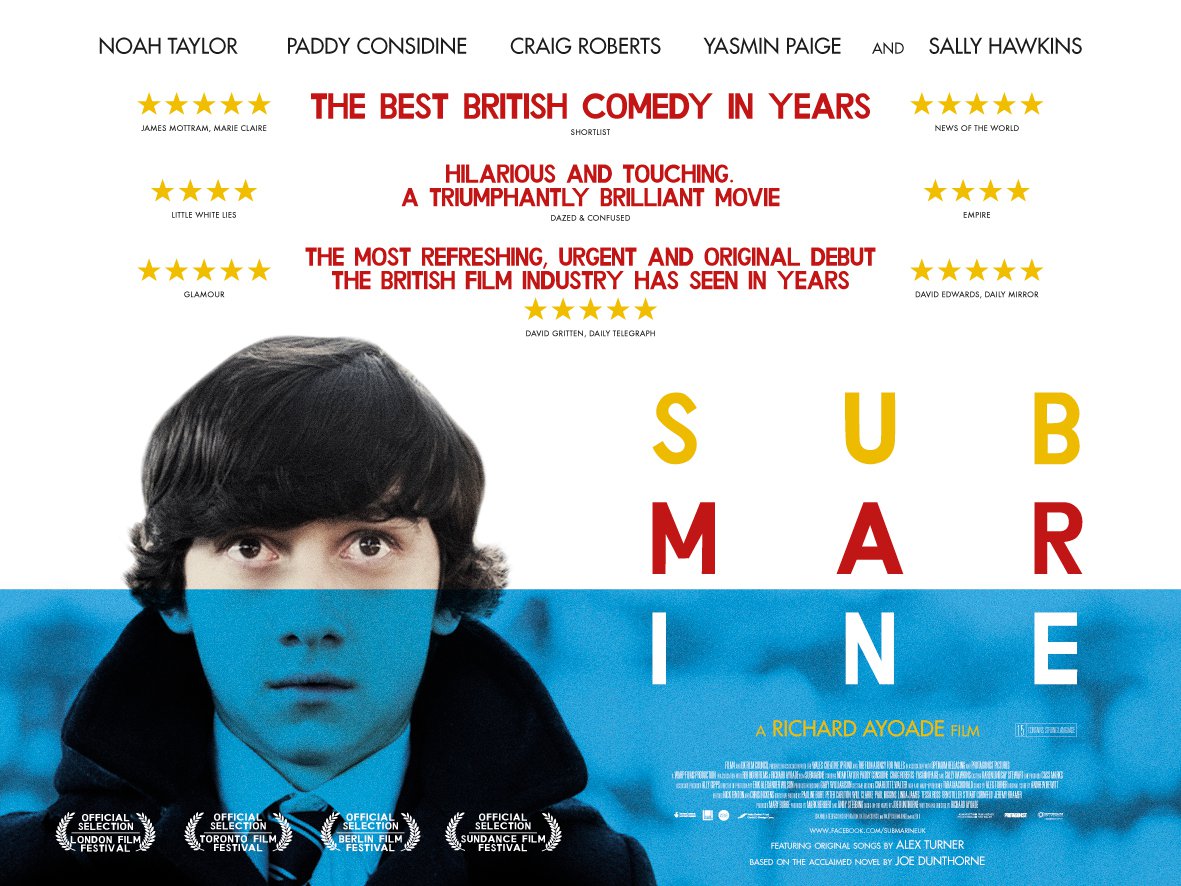
Within the trailers, there are several creative ways of presenting the text and titles. In the Submarine trailer, the title of the film is left until the end, and is presented using colours that are actually important throughout the film, however, throughout the trailer, text is used to give structure to the images and clips on the screen and to introduce the protagonist (it actually says this in text, as this is relevant to the strange organised nature of the main character). This is similar in the Perks of being a Wallflower trailer, as text is again used to introduce characters and establish a vague storyline. In the Moonrise Kingdom trailer, text is actually used to give a cast list as the film features some very famous actors and actresses, which is different to the other two.

In all 3 trailers, a large variety of scenes are featured, especially in the Submarine and Moonrise Kingdom trailers. As well as this, a variety of interesting camera shots are used, again, mostly in the two I mentioned previously - the quirky features of both films are portrayed within the trailers, and the interesting cinematography is similar. 

The pace of the trailers all seem moderate, and not as quick as an action packed blockbuster (clearly this is due to the content of the rites of passage genre). The pace does change slightly, getting a little bit quicker towards the end, indicated by the change in music. As well as this, in all 3 there is a turn line, where the music dies as a character says a single line. This seems to be a connotation of film trailers in general. 

Many films from this genre are quite quirky and unusual (as the films usually feature an outcast which is unusual themselves), and due to this, it is easy to spot the common traits of these trailers. Below are the links to the 3 trailers I have analysed. 

The Perks of being a Wallflower - https://www.youtube.com/watch?v=n5rh7O4IDc0